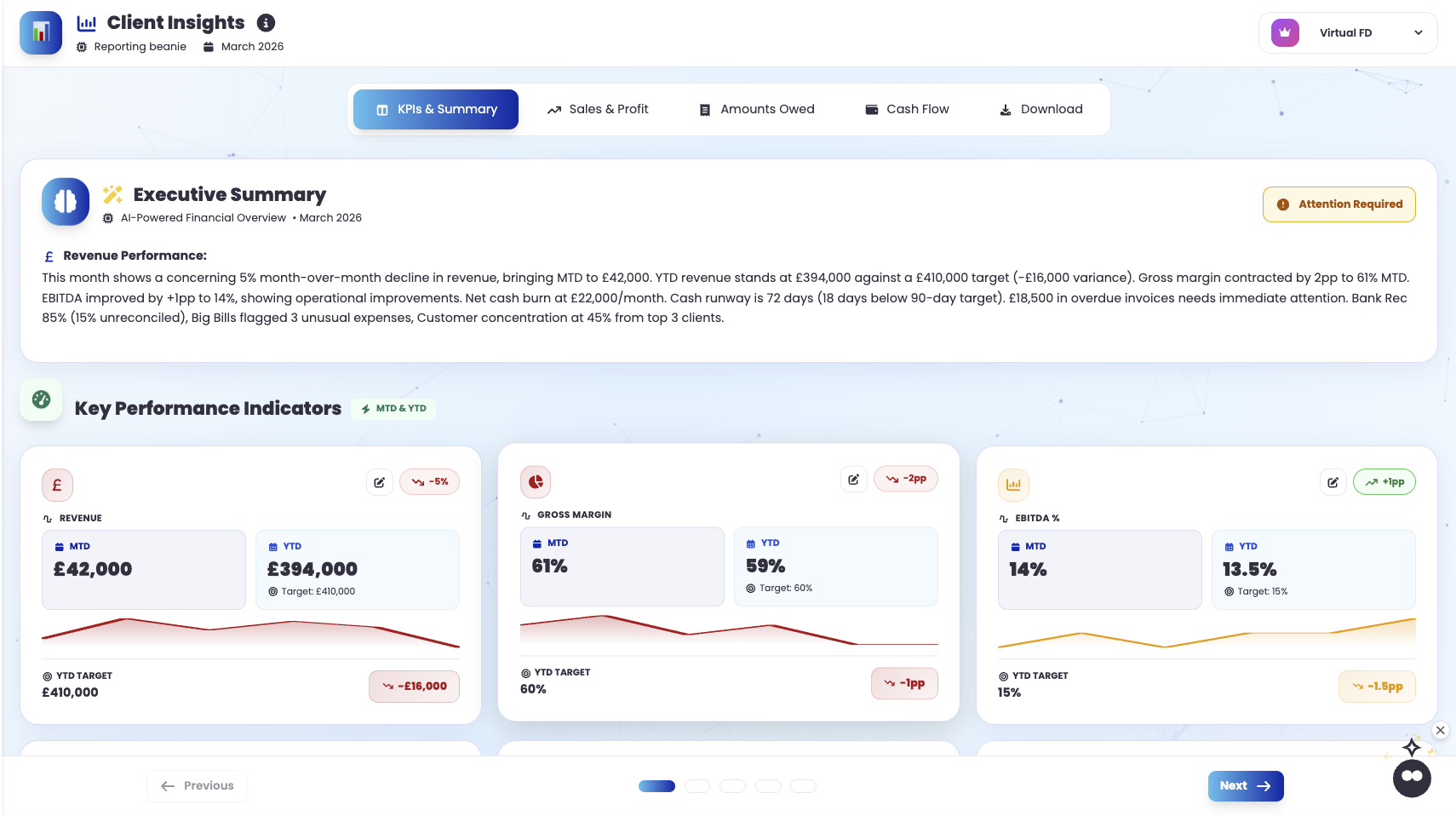
How to Build Dynamic Excel Dashboards for Your Clients
As a bookkeeper or accountant, one of your key responsibilities is to provide clients with clear, insightful financial reports that enable them to make informed decisions. While the raw data from cloud accounting systems like Xero, QuickBooks, or Sage is essential, transforming this information into something visually appealing and easily digestible is where you can add significant value. In short, this is where you become a rock star!
Dynamic dashboards are a powerful way to present data, giving your clients an interactive experience where they can explore their financial and management accounts with just a few clicks. In this article, we’ll guide you through building effective and impressive dynamic dashboards using just Microsoft Excel — a tool you’re likely already familiar with but may not be fully leveraging for this purpose.

Why Use Dynamic Dashboards?
Before diving into the “how,” let’s briefly discuss the “why.”
Firstly, dynamic dashboards allow your clients to:
- Visualise Key Metrics: Easily grasp their financial health through charts, graphs, and tables.
- Interact with Data: Filter, slice, and dice data based on their preferences, making reports more relevant and personalised.
- Make Informed Decisions: Gain quick insights into their business performance without sifting through endless rows of numbers.
All of this can be achieved without the need for expensive software or SaaS subscriptions, using a tool you already know well, and which is more than capable of delivering dynamic dashboards that impress and delight.
Step 1: Setting Up Your Data
The first step in creating a dynamic dashboard is gathering and organising your data. Here’s how you can do it:
- Export Data from Your Cloud Accounting System. Most systems allow you to export monthly financial and management accounts directly into Excel. Save this data in a clean, structured format, preferably in separate worksheets for easy reference.
- Structure Your Data. Ensure your data is well-organised. Use Excel tables to structure your client data, which makes it easier to reference and more dynamic when adding new data each month. Label your columns clearly and maintain consistent formatting.
- Create a Data Summary Sheet. Summarise key metrics from your raw data. This could include totals, averages, or percentages — whatever is most relevant to your client’s needs.
Step 2: Building the Dashboard
With your data in place, it’s time to start building the dashboard:
- Create a New Worksheet for the Dashboard. Start with a blank canvas. Name this sheet something intuitive, like “Dashboard.” (sorry for stating the blindingly obvious)
- Design the Layout. Plan your dashboard layout. Consider what your client needs to see at a glance — such as revenue trends, expenses, HMRC balances and cash flow. Group related metrics together, leaving room for charts and interactive elements.
- Insert Tables and Pivot Tables:
- Use Excel tables to display key metrics in a clear, concise manner.
- Pivot Tables are particularly powerful for summarising data. They allow you to quickly rearrange data, showing different perspectives without altering the raw data.
- Add Charts and Graphs. Visual elements make your dashboard more engaging. Use a mix of bar charts, line graphs, and pie charts to represent different types of data.
- Sparklines are great for showing trends over time in a compact format.
- Conditional formatting can be used to highlight important data points, making the dashboard more visually appealing.
Step 3: Adding Interactivity
This is where your dashboard becomes dynamic, try using some of these:
- Slicers. These are visual filters that allow users to quickly filter data in Pivot Tables and Pivot Charts. Insert a Slicer (found under the Insert tab) for each category you want to filter by, such as time periods, departments, or product lines.
- Timelines. These are similar to Slicers but specifically for dates, allowing clients to filter data by months, quarters, or years with ease.
- Dropdown Menus. Create these using Data Validation (found under the Data tab) to allow users to select different variables. For example, a dropdown could let them choose between different financial metrics (like Gross Profit, Net Income, etc.), which updates the data displayed in charts or tables accordingly.
- Interactive Buttons. Add buttons (found under the Developer tab) to run specific macros, which can automate repetitive tasks like refreshing data or generating reports. This can make the dashboard even more user-friendly.
Step 4: Sharing the Dashboard
Finally, ensure the dashboard is easily shareable and accessible:
- Use Excel’s Sharing Features. Excel Online or OneDrive makes it easy to share dashboards with clients. Simply save the workbook in a shared location and adjust the permissions so that your clients can view or edit as needed.
- Password Protection. If sensitive data is involved, protect your workbook with a password. This way, you can control who has access to the data and prevent unauthorised changes.
- Maintain an Update Schedule. Set a regular schedule for updating the dashboard with new data, ensuring that your clients always have access to the most current information.
Conclusion: Impress and Empower Your Clients
By following these steps, you’ll be able to create dynamic, interactive dashboards that not only impress your clients but also empower them to take more control of their financial data. The use of Excel means you (and probably your client) are working within a familiar environment, but with these advanced techniques, you’ll be elevating your service offering to a whole new level – and it’ll cost next to nothing, but give maximum return!
Remember, the key to a great dashboard is clarity, relevance, and ease of use. Keep your clients’ needs at the forefront, and your dashboards will become indispensable tools in their business decision-making process.


Leave A Comment